Artists and information that have impacted my practical work.
MARK TOBEY
SOURCE: TATE LIVERPOOL (GALLERY VISIT)
LANDSCAPE/COLOUR/ABSTRACTION
Studied Calligraphy in Japan and China, Tobey developed a technique of painting with rapid brushstrokes which he called WHITE WRITING.
Mediative response to Landscape
“Seattle where I painted this picture is a place of virginal winds, air currents and intermingled seasons…grey skies, grey water and make one conscious of this colour and I have used series of grey loves which seem so indigenous to the locate”

MILTON AVERY
SOURCE: TATE LIVERPOOL (GALLERY VISIT)
Painted after Avery visited Provincetown in Cape Cod, where he undertook sketches and watercolours of the surrounding area. On returning to NY studios, he would develop the scenes into compositions reduced to simplified colours and shapes. This often led to his works such as Yellow Sky appearing simultaneously abstract and representational.
ADELYN BREESKIN (CURRATOR)
“The distortion of his shapes are bold but accurate, and his simplification always retain sufficient identity with his subject to be entirely readable”
ABSTRACTION/REALIST/LANDSCAPE/COLOUR

MARK ROTHKO
SOURCE: TATE LIVERPOOL (GALLERY VISIT)
“Confronted with the floating rectangle common in Mark Rothko’s works, many art critics sought equivalence in the recognisable world, exploring their relevance/relations to landscape, windows and even the cinema screen.”
‘Although interpretations the sombre brown and grey art historian to connect the appearance of paintings such as this to the desolate moonscapes that were so topical when it was made”
LANDSCAPE/EXISTENTIALISM/ABSTRACTION/REALIST

THEA THICKMAN
SOURCE: “THE GALLERY” GALLERY IN HOLT, NORFOLK
- Contemporary Artist based in norfolk
- Predominantly exploring large skies, clouds, horizons and Seas
- Based on the Norfolk Coastline and arable farmland
- Degree in Painting
- Self Taught painter
- Focuses on her Journey as a painter
- Artwork depicts simply our relationship with a place, stillness and motion in large abstract seascapes and landscapes in oil paint and mixed media on canvas.
LESLEY WILLIAMS
SOURCE: “THE GALLERY”, GALLERY HOLT, NORFOLK
- Regular visitor to wells – local Norfolk seaside town
- Studied History of art and specialised ceramics
- Taught art – specialised in painting, mainly oil and acrylic
“An ever changing garden is a great inspiration as well as seascapes experienced while messing around in boats, or walking along the north Norfolk coast.”
- Plein air and studio Painting
- Expressive colour reflects moods or sense of place if completed in studio she refers to photographs, notes of mood and emotion.

SANDRA EASTON
SOURCE: “THE GALLERY’, GALLERY, HOLT, NORFOLK
- Studied painting at Harrow and Kingston Colleges of Art
- Diploma in Art Therapy
- Worked as a Medical instructor in a London Hospital chief interest in landscapes:
“I enjoy observing and portraying the east Anglian countryside with its ever-changing light or often surprising colours. My aim is capture the feel or spirit of a place and the particular significance or trees in the landscape”

RICHARD DIEBENKORN
SOURCE: METROPOLITAN ART GALLERY, NEW YORK
OCEAN PARK (NO.30) 1970

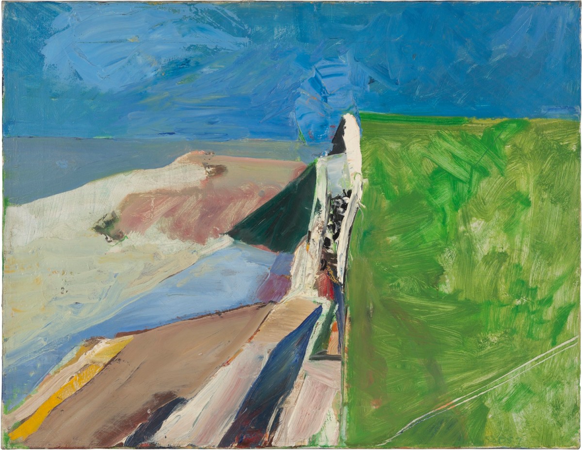
I choose to include these particular pieces within my artist research as I found the colour palette and the vibrancy in both paintings invigorating. I really liked the bright hue and the warmth and refreshing cognitive response I got from looking at these paintings. I feel whilst avoiding a strongly conceptual style of painting, the use of colour is really important as it speak too viewer about what you want the, to take from your work; the meaning behind it and its depth.
ANSELM KEIFER
SOURCE: METROPOLITAN ART GALLERY, NEW YORK
BOHEMIA LIES BY THE SEA (1996) ‘BÖHMEM LEIGT AM MEER’
‘While this recent landscape is characteristic of Kiefer’s command of scale and his coupling of deep perspectives with exceptionally rich impastoed surfaces, it conveys a lyrical, even elegiac, mood that has emerged in the artist’s work since he left Germany to settle in France. Along the center ridge and on either side of the rutted country road bloom an abundance of pink-orange poppies, a flower associated since antiquity with dreams, sleep, and death. The poppy is also the emblem of military veterans, whose presence is evoked here by occasional drips of paint the color of dried blood. Kiefer has further enriched the surface with streaks of light-reflecting shellac. He inscribed the title of the work along the extremely high horizon line and along the left side of the road, where the partly obscured letters diminish in size as they recede. Kiefer took the words from the title of a well-known poem by the Austrian writer Ingeborg Bachmann (1926–1973) that concerns longing for utopia while recognizing that it can never be found, just as the former kingdom of Bohemia, landlocked in central Europe, can never lie by the sea.’
– The Met Museum/Gallery
Bohemia Lies by the Sea
- Kiefer is a member of the third generation avant-garde artists in postwar Germany,
- Supposedly can be seen as one of the most important German Painters since WWII.
- Rooted in Abstract Expressionist Style to resonant subject matter from literature, history and politics.
- His paintings are usually divided by in the center by country roads that recedes in very deep perspective towards an extremely high horizon. (Böhmen Liegt Am Meer)
- Artist’s iconography is highly original, with complex layers of meaning enriched by irony and contradiction.
- Keifer has taken the title of the landscape from the renowned Australian poet Ingeborg Bachmann.
Kiefer work was seen at the Met Gallery in New York. I choose to include this within my artists research as felt the use o colour and texture were really interesting. I also made an immediate connection with some of the aerial footage I was able to gather of the landscapes around where I live. I could clearly make a convincing connection due to the strong and central field tracks as seen in Kiefers work.
YVONNE JACQUETTE
SOURCE: METROPOLITAN ART GALLERY, NEW YORK
LITTLE RIVER FARM (1979)
Similarly to Kiefers work I made a strong connection to the aerial photographs I took. I am really drawn in by the the field patch work and the interconnecting factor of them all. I like how the overall umbrella in which they are all contained under is ‘agriculture’, yet upon closer inspection they are used and treated on very different ways. This contrasting and contradicting approach to analysing the landscape is something that I have found really interesting and will continue to develop further.
CAMILE PISSARRO
SOURCE: METROPOLITAN ART GALLERY, NEW YORK
LANDSCAPE, ÎLE-DE-FRANCE (1873)
DANIEL GOULD
SOURCE: TUTORIAL AND FEEDBACK
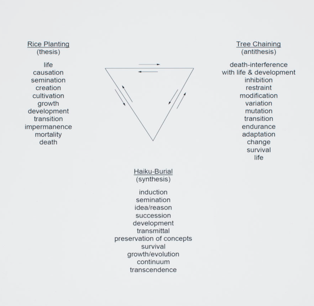
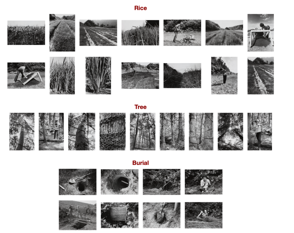
AGNES DENES
SOURCE: TUTORIAL AND FEEDBACK
- Denes artistic practise is distinctive in terms of its aesthetics and engagements with socio-political ideas
GREAT LINK AS MY WORK EXPLORES SOCIO/POLITICAL/ENVIROMENTAL IDEAS
- As a pioneer of environmental art, she created Rice/Tree/Burial in 1968 in Sullivan County, New York which, according to the renowned art Historian and curator Peter Selz, was ‘probably the first large scale site- specific piece anywhere with ecological concern
MUST LOOK INTO THUS FURTHER
NB- THE IMPORTANCE OF SITE SPECIFIC AND ECOLOGICAL CONCERN.
http://cornell70.org/AgnesDenes.aspx
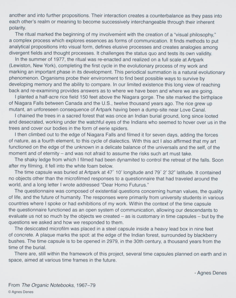
RICHARD SHILLING
SOURCE: TUTORIAL AND FEEDBACK
All information found from ;
https://www.richardshilling.co.uk/bio.html
“… through my art I am seeking to deepen my connection with nature and find opportunities to reveal the cycles, forms and nuances hidden within…”
- Leading artists in the field of ephemeral natural art
- Works with natural materials gathered from the environment and created in natural locations, photographing each sculpture in ambient light.
- He uses the environment to guide and aide his creative process, adapting and changing ups ideas due to influential ideas discovered from the environment he is working with.
- Shilling explores themes of existence, transience through an ever deepening relationship with nature.
- His process is completely authentic and nature as he only uses found and natural resources and materials.
- no photoshop occurs in Shillings photographs, we ensures all photos are taken in natural light.
- The majority of the time natural resources are used as the aim is to show what is possible with natures materials, however occasionally sparse use of non natural materials are used during constructions.
Interview: Ephemeral Land Art by a Man Who Discovered His Creativity in Nature
- “Ephemeral art” – meaning lasting a very short amount of time
- Inspiration came from fellow land artists Andy Goldsworthy
- His work comes in the form of photographs which takes of every creation he has made.
‘IT IS WELL-KNOWN THAT ANDY GOLDSWORTHY WAS A BIG INFLUENCE ON YOUR EARLY WORK. HOW DID YOU FIRST COME UPON HIS WORK AND WHAT WAS IT ABOUT HIS ART THAT SO MOVED YOU?’
SHILLINGS REPLY….I was born and brought up in the South-East of England but eventually, I moved to North-West England for work and set up home in the city of Lancaster. As I explained I love the outdoors and one day I was out running in the local hills that overlook the city and on top of a remote moor several miles from the nearest road I came across one of Goldsworthy’s stone installations. Perhaps I had low blood sugar from the exercise! But I couldn’t quite get my head around what it was and why it was there. I asked around and eventually found out who had created it. I hadn’t heard of Goldsworthy at that time, but I bought one of his books and was instantly blown away by what I saw as I am sure many people who first see his work are.
It was his ephemeral sculptures that inspired me greatly. In a single moment, his vision communicated to me the potential of gathering together properties inherent in nature and combining them in such a way as to create a magical moment captured in a photograph. It was like hearing an electric guitar played beautifully for the first time. Before that moment the sound of an electric guitar did not exist in your world but afterward, you are forever changed by the discovery.And that is how it was with Goldsworthy’s work. Once I had seen it, my worldview and it’s potential instantly expanded and could not return to how it was before. That was the genius of his vision and his gift to me.
- Shilling elaborated further discussing how it can be extremely difficult for artists to understand their own personal style and creative process.
- The idea that with Ephemeral nature art is when you begin to explore nature and the materials and found objects associated with it. The idea is that you use your intuitive to express nature through what you create and not setting off an idea of what you want to make and then making the materials match your first preconceived ideas.
- Its important to note Shilling saying “it isn’t making things with nature, it is expressing nature through making things. once I realised this, it was like someone switched the lights on and it set me off on a path of peeling back the layers of nature and trying to see more deeply each time that I look.”
I have chosen to note down Shilling’s words regarding na ideas as I feel within my own critical reflections this is a really important to note that a piece of work shouldn’t be forced. My work last term become pushed to show a certain aspect which made it repetitive and lack purpose that was interesting. This is important to my practise as I have been advised to create work that is about a certain topic but not forced. I need to understand a way of creating more work without the outcome looking completely intentional and forced. My studio work and practise should remain fun and exciting, with plenty of room fo development and finalisation.
RACHEL HEARD
SOURCE: TUTORIAL AND FEEDBACK

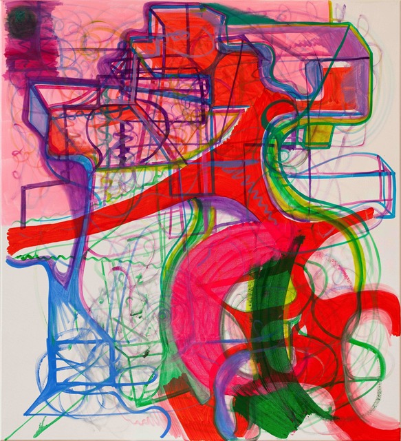
PETER BONDE
SOURCE: ‘Vitamin P’ book, accessed pages 44-45
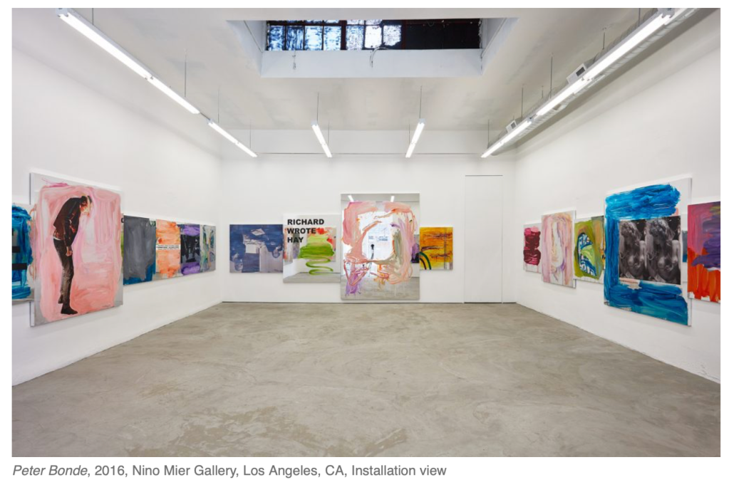
- Physical facts of painting
- Rejecting the glut of imagery in the world from various media he choose images from his own life – not diaristic or narrative per se-as a way to organise the formal elements of his social work.
- Uses paintings as the most recognisable “sign” of art whilst introducing installation processes that reflect the new artic media.
- “Spectacle” he affected the individual in contemporary culture.
- Work has more to do with action and theatric paintings carry an element of performance.
- At a first glance Bonde’s art objects appear to be conceptually wrapped or packaged, events. But his Rhetoric has an understanding virtuosity, a capacity for producing unexpected effects.
- Bonde’s asks the viewer to identity with the position of both participant and spectator. The fragility of the relation- skips between performer and spectator is foreground and the spectator’s power of judgement is emphasised.
- Provide channels for empathetic interpretation.
- Explore the relationship between painting and individuals and its psychological manipulation.
IMPACT ON MY OWN WORK:
- I am particularly interested in the connection Bonde makes between the relationship between painting and individuals and the psychological impact that then has. It reminds me go phenomenology and the process of intentionality. Bonde’s idea although conceptual are designed to force the viewer to perceive it in a certain way whilst also having the freedom to explore the emotions provoked by the art work. This process is something that I want to explore within my on practise. I aim to make my work less conceptual than previous terms and instead really provoke and explore the idea I have and what motivates it. My aim having looked at Bonde’s work is to make a statement and prove a point, make the work the idea rather than have the idea become more important than the actual artwork. I would like to make the viewer certain of what my art is about and have a direct impact; the idea of “it is what you see”.
NB. CONCEPTUAL ART – Conceptual art is art for which the idea (or concept) behind the work is more important than the finished art object. It emerged as an art movement in the 1960s and the term usually refers to art made from the mid-1960s to the mid-1970 (TATE ONLINE REFERENCE)
JANE CALLISTER
SOURCE: ‘VITAMIN P’ book, accessed pages 54-55
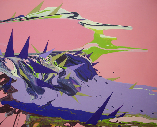
- A fair representation of where her art comes from and where it takes viewers who consider its promiscuous propositions seriously.
- In Callister’s hands, there is no difference between the ornamental and the organic.
- Her work takes painting well beyond the stodgy oppositions that once animated its discourse; abstraction versus repsentation, figure versus ground, colour versus line, content versus form and the personal versus the political.
IMPACT ON MY OWN WORK:
- Although her work is not directly correlated to my practise I am intrigued by Callisters work due to the above fragment that I have chosen to include in my notes. I am driven and interested by the accepting contrast between states within her work, such as personal vs political and how they are expressed through the use of line shape and colour. The palette choices Callister enable the viewer to create a link between thought and feeling as well as creating a in depth sense of representation. Although one of my main focuses is to make my work look less conceptual I am interested in how the relevance of representation impacts her work. This is something I should enquire within my own practise.
PIA FRIES
SOURCE: ‘VITAMIN P’ book, accessed pages 110-111
- Battle between conceptual aesthetic and Modernist painting – the dominant artistic expression of the twentieth century.
- Raises the question “Is painting dead”
- Unleashes a cacophony of colour and texture onto each hard white field to crater her sophisticated, energetic painting.
JOANNE GREENBAUM
SOURCE: ‘VITAMIN P’ book, accessed pages 128-129
NICOLA HICKS
SOURCE: FOLLOWING TUTORIAL WITH HELEN (OFFICE HOURS)

REBECCA WARREN
SOURCE: FOLLOWING TUTORIAL WITH HELEN (OFFICE HOURS)

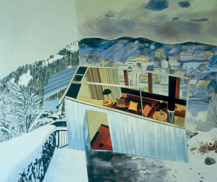
DEXTER DALWOOD
SOURCE: FOLLOWING TUTORIAL WITH HELEN (OFFICE HOURS)